Where mountain meets brand

Madonna di Campiglio
Office: Milan
Transforming a place into a brand is a complicated process that goes beyond associating a logo with that place. And this process is even more complex if you must consider several geographical areas, each with its own heritage, culture, and identity.
This was the case for the vast Italian region of western Trentino: Madonna di Campiglio. A region that stretches from Campo Carlo Magno and the Lake Idro, to Madonna di Campiglio – a location that draws tourists from over 50 different countries around the world every year and is known for hosting the skiing world championships.
Interbrand’s role was to help this touristic area become a brand that embodies and conveys a clear, unique, and shared ambition; able to fit the area’s multiple identities and leverage the interaction with individuals, public administration, and economic community through a consistent experience strategy.
Madonna di Campiglio Tourist Board’s breakthrough decision to break with the past was the starting point of this ambitious plan. A Strategic Destination Plan was defined with the goal of creating a hub – set among a unique, distinctive mosaic of resources in the places that make up its wider surroundings – that had the potential to attract new, increasingly segmented types of tourists, and commercial partners.

To determine the core values of the brand, Interbrand conducted a strategic analysis, based on an immersive audit and interviews with stakeholders. The result? A new shared and unambiguous ambition: to promote the region’s natural assets with a sustainable approach, and to emphasise the area’s Italian character through a high-quality offering which reflects the Italian excellence, elegance and premiumness.
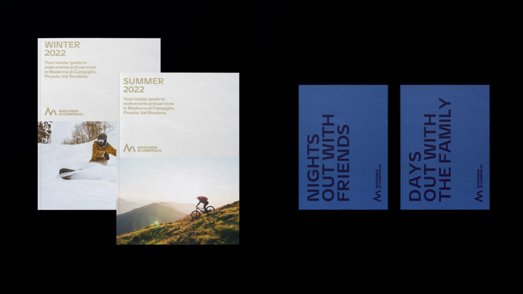
We then translated this into a strong visual identity – which conveys the values of the towns that make up the valley – and into experiences that are consistent with that identity.
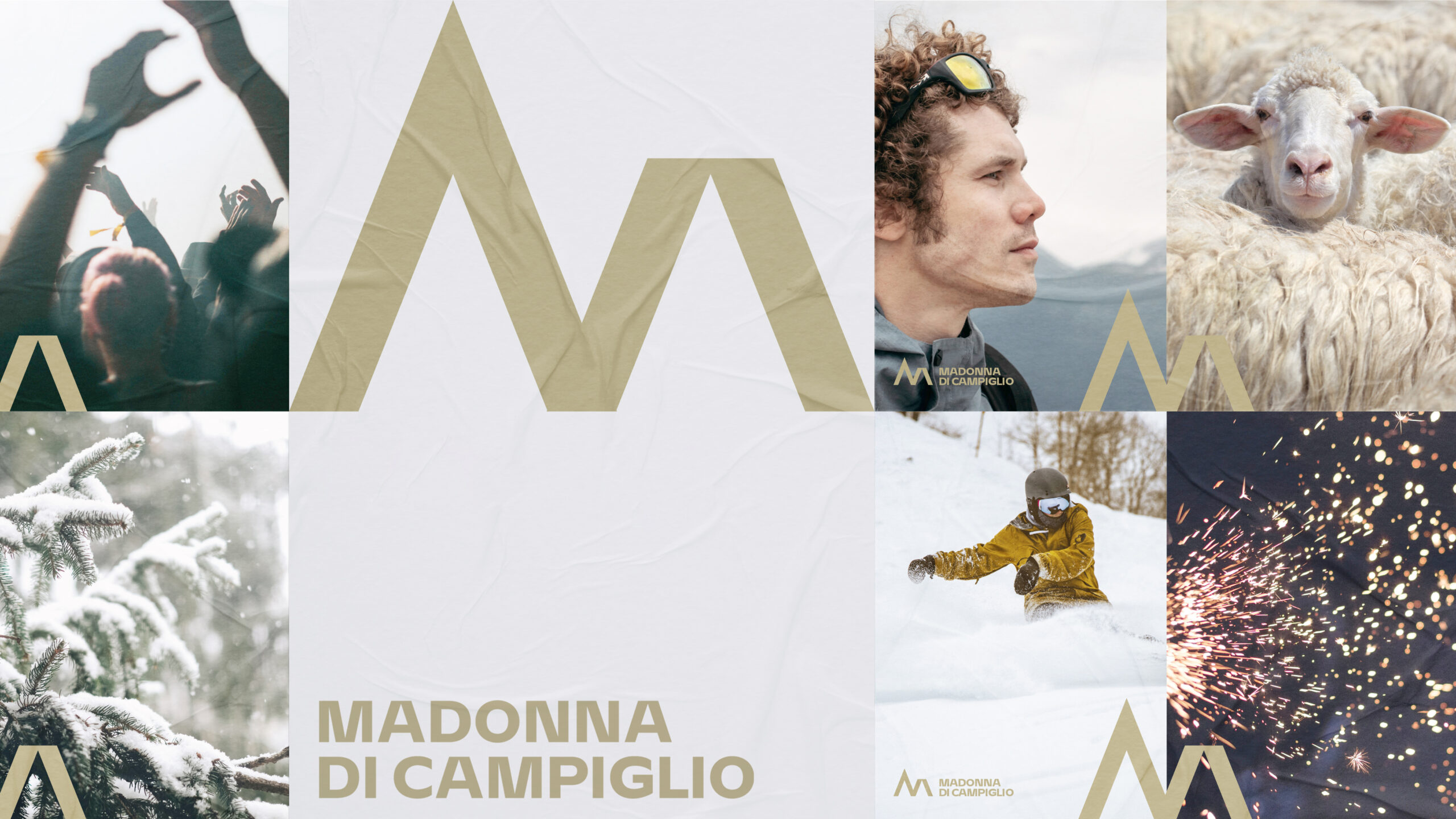
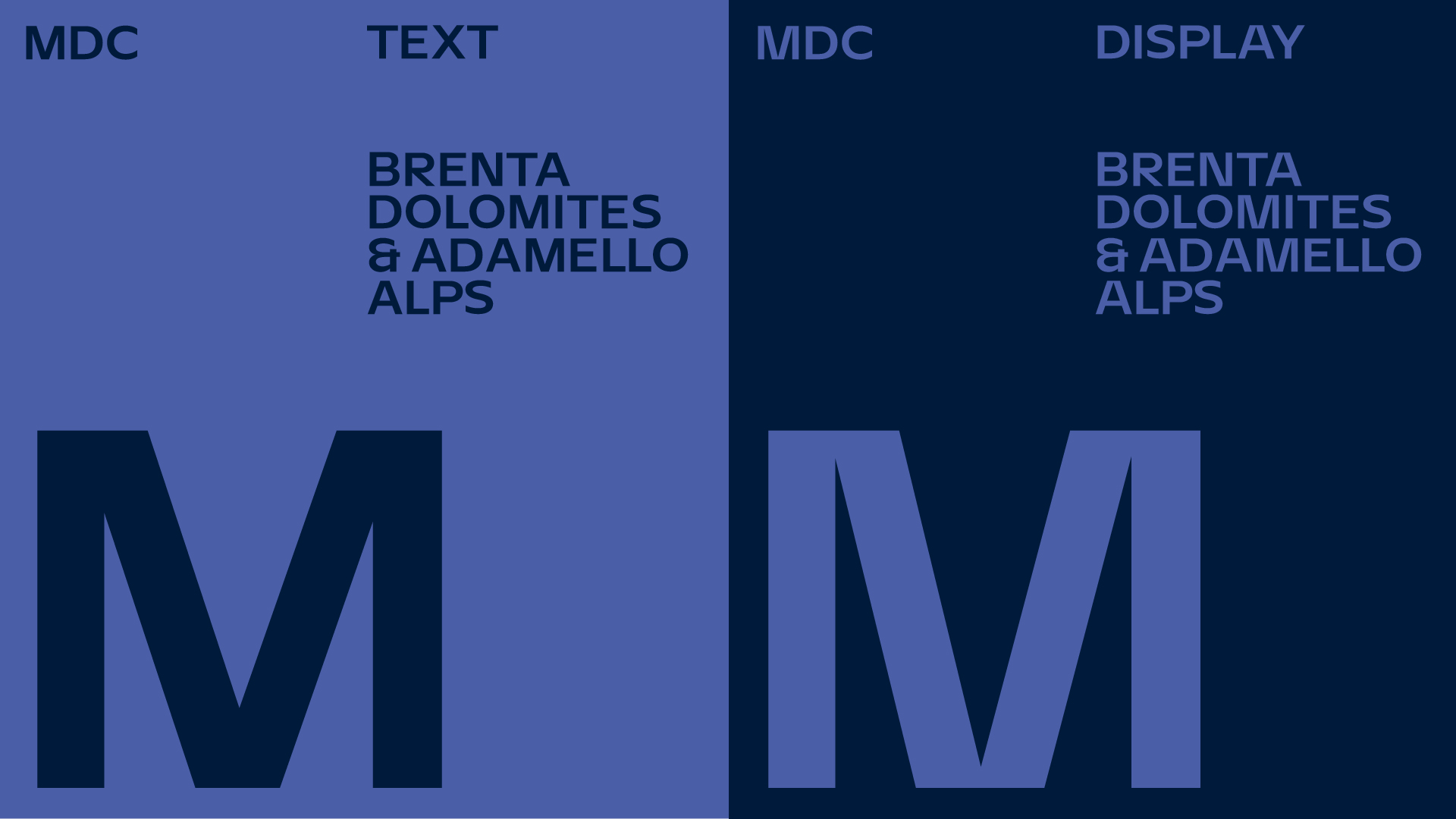
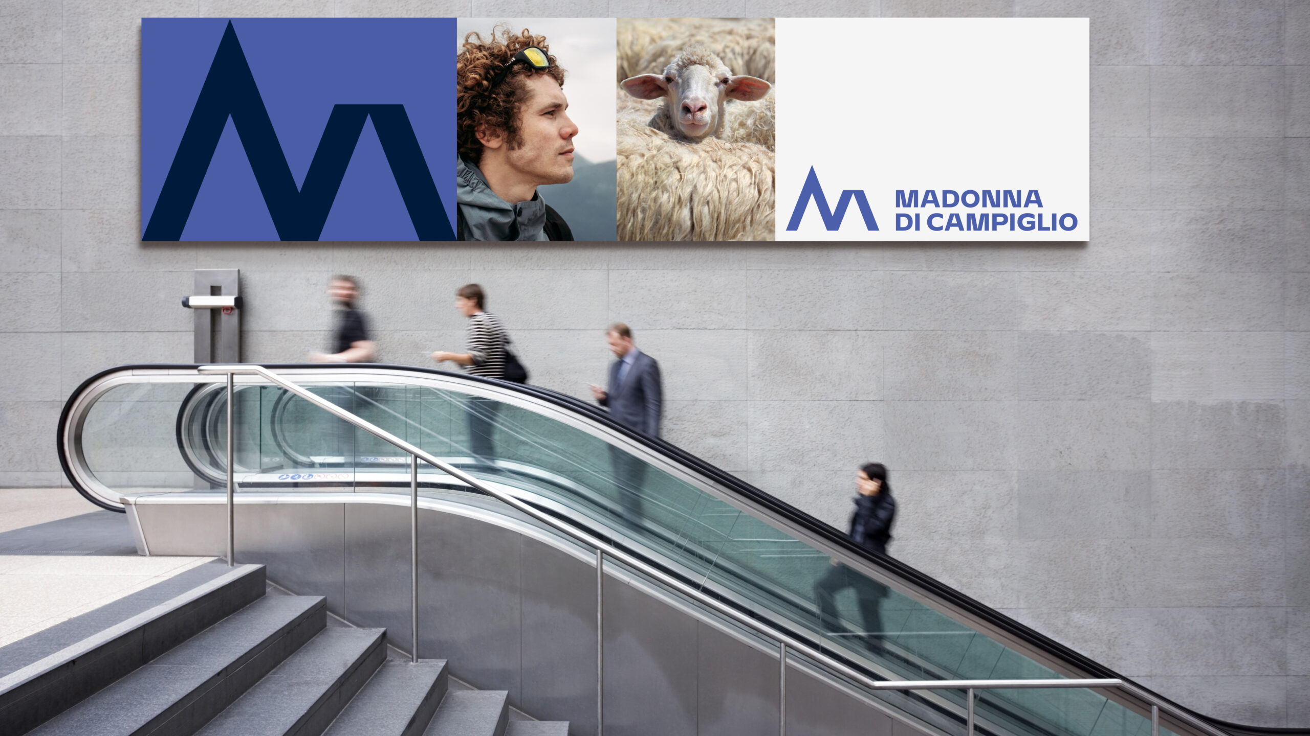
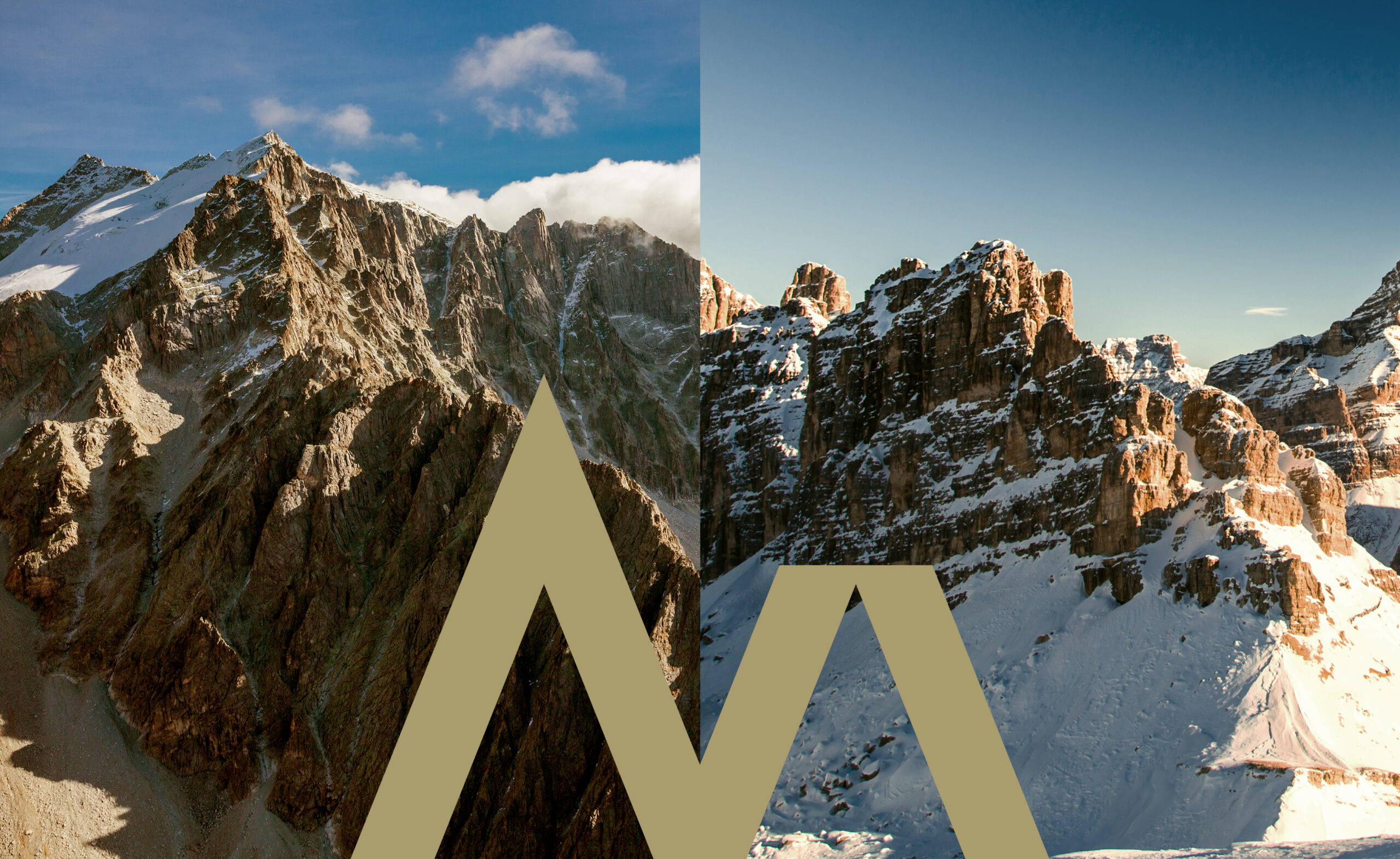
The new logo is an ‘M’ with a contemporary design. Its high-end look reflects contemporary minimalism, and it is formed by two elements: the ‘M’-shaped symbol and the ‘Madonna di Campiglio’ logotype. The two mountains represented in the ‘M’ reflect the current shift in the destination strategy: the mountains are alive all year round and their features make it possible to appeal vertically to clearly defined target groups of visitors, whether existing or potential, on the international market. They symbolise the meeting point between the majestic Brenta Dolomites and the solid Adamello-Presanello Alps; and they evoke one of the world’s most extraordinary mountain scenarios and underline the broad-ranging local identity where beauty is found in the convergence of opposites. Furthermore, Interbrand has designed custom typeface to support the visual system, featuring two complete families: Text and Display. The latter recalls the details of the M symbol, representing the uniqueness of the valley where the two italian mountain ranges, Brenta Dolomites and Adamello Alps, meet.
The result of Interbrand’s work – based on creative and strategic disciplines is a single name, Madonna di Campiglio, a new visual identity, and an updated experience strategy.
Having defined its new brand, Madonna di Campiglio has begun a growth journey. The valley now expresses itself through a visual language and consistent experiences, based on content and working on the multiple products offered by this broad area. A truly new ecosystem of services, products and experiences that will radically transform the way in which Madonna di Campiglio presents itself and interacts with all stakeholders.